CSS/CSS 이론
[CSS] 애니메이션
2주녘
2023. 8. 16. 10:55
반응형
transition 속성
- transition-property : 애니메이션 효과를 부여할 속성들을 나열
- transition-duration: 속성들의 지속시간(속도)
예제) 박스에 마우스를 올리면 애니메이션 효과가 나타나게 적용
<!DOCTYPE html>
<html lang="en">
<head>
<meta charset="UTF-8">
<meta name="viewport" content="width=device-width, initial-scale=1.0">
<title>Document</title>
<link rel="stylesheet" href="./css/07_ant_transition.css">
</head>
<body>
<div class="box1"></div>
</body>
</html>
.box1 {
width: 100px;
height: 100px;
background-color: cornflowerblue;
/* 외곽선 */
border: 1px solid black;
/* 바깥여백 */
margin: 20px auto;
/* TODO : 애니메이션 추가 박스 클레스에 생성 */
/* transition-property: 애니메이션 효과를 부여할 속성 나열 */
/* 사용법 : transition-property: 속성1, 속성2, .... */
transition-property: width, height;
/* 지속시간 : 애니메이션 효과를 지속할 시간 */
/* s(second) 초, ms(mili second) 1/1000초 */
/* 사용법 : transition-duration: 지속시간, 지속시간; */
transition-duration: 2s, 1s;
}
/* 박스의 마우스가 위로 올라가면 :hover */
.box1:hover {
/* 가로 100px -> 200px */
width: 200px;
/* 세로 100px -> 120px */
height: 120px;
}
transition 축약식
transition : 속성적용범위 속도차이효과 지속시간
<!DOCTYPE html>
<html lang="en">
<head>
<meta charset="UTF-8">
<meta name="viewport" content="width=device-width, initial-scale=1.0">
<title>Document</title>
<link rel="stylesheet" href="./css/08_ani_transition2.css">
</head>
<body>
<div class="box"></div>
</body>
</html>
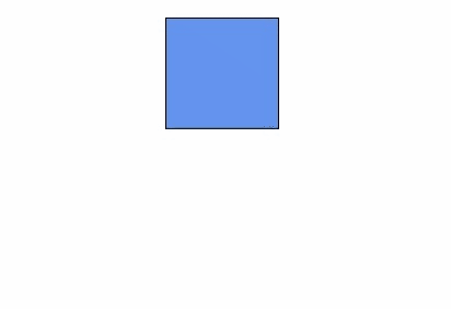
.box{
width: 100px;
height: 100px;
/* 가로 중앙 */
margin: 50px auto;
border: 1px solid black;
background-color: orange;
/* 애니메이션 구현(축약식) */
/* all : 모든 속성에 애니메이션 부여 */
/* ease-in : 시작(천천히 진행)-끝(빠르게 진행) : 속도차이가 있는 속성 */
/* 2s : 2초(지속시간) */
/* 사용법 : tansition : 속성 속도차이효과 지속시간 */
transition: all ease-in 1s ;
}
.box:hover{
width: 200px;
height: 200px;
background-color: red;
}
[실행결과]
<!DOCTYPE html>
<html lang="en">
<head>
<meta charset="UTF-8">
<meta name="viewport" content="width=device-width, initial-scale=1.0">
<title>Document</title>
<link rel="stylesheet" href="./css/09_ani_transition3.css">
</head>
<body>
<div class="bg-tr"></div>
<div class="border-tr"></div>
</body>
</html>
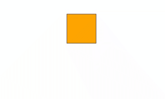
/* 박스 2개 공통속성 디자인 */
div {
width: 100px;
height: 100px;
margin: 30px;
/* 좌측 배치 : 가로 배치(display: inline-block) */
float: left;
}
/* 1st 박스 */
.bg-tr {
background-color: skyblue;
/* TODO : 애니메이션 부여 */
/* ease : 시작(천천히) 중간(빠르게) 끝(천천히) */
transition: all ease 1s;
}
.bg-tr:hover{
background-color: blue;
}
/* 2nd 박스 */
.border-tr {
background-color: orange;
/* linear : 등속 >> 시작 - 중간 - 끝 속도가 같음 */
transition: all linear 1s;
}
.border-tr:hover{
background-color: red;
/* border-radius:50% = 원 */
border-radius: 50%;
}
<실행결과>
반응형