
반응형
절대좌표(absolute)
- 웹브라우저 화면에 좌표가 생김
- left / top을 이용해서 태그를 이동시킬 수 있음
- 참고 position:static(기본, 생략, 좌표없음)
<!DOCTYPE html>
<html lang="en">
<head>
<meta charset="UTF-8">
<meta name="viewport" content="width=device-width, initial-scale=1.0">
<title>Document</title>
<link rel="stylesheet" href="./css/12_position_absolute.css">
</head>
<body>
<div class="box"></div>
<div class="box2"></div>
<div class="box3"></div>
</body>
</html>
.box{
width: 100px;
height: 100px;
background-color: red;
/* 절대좌표(absolute)를 설정해야 좌표 설정이 가능 */
position: absolute;
/* 왼쪽(x좌표) */
left: 0;
/* 위쪽(y좌표) */
top: 0;
/* 겹칠때 위에 올라오도록 우선순위를 정하는 속성 */
/* 규칙 : 수치가 클수록 위, 작을 수록 아래로 */
z-index: 30;
}
.box2{
width: 100px;
height: 100px;
background-color: yellow;
position: absolute;
left: 40px;
top: 40px;
z-index: 20;
}
.box3{
width: 100px;
height: 100px;
background-color: blue;
position: absolute;
left: 80px;
top: 80px;
z-index: 10;
}

절대좌표는 웹브라우저 화면 기준이다.
position: absolute 선언 후
left: 값;
top: 값;
을 입력한다.
만약 태그 속성들이 겹친다면 우선순위를 주는 속성
z-index: 값; 을 설정해주면되고
값은 적절한 수를 입력해주면 된다.
값이 클수록 제일 위로 올라오게 되고 작은 값이 아래로 내려간다.
상대좌표(relative)
- 상대좌표는 웹브라우저 화면 기준이 아닌 태그 기준으로 좌표를 설정한다.
<!DOCTYPE html>
<html lang="en">
<head>
<meta charset="UTF-8">
<meta name="viewport" content="width=device-width, initial-scale=1.0">
<title>Document</title>
<link rel="stylesheet" href="./css/13_position_relative.css">
</head>
<body>
<p>안녕하세요, 홍길동입니다.</p>
<p>안녕하세요, 홍길동입니다.</p>
<p>안녕하세요, 홍길동입니다.</p>
<div class="abox"></div>
<div class="rbox"></div>
</body>
</html>
/* 상대 좌표(relative) 예제 */
/* 특징 : 현재 태그가 있는 위치부터 (0, 0) 시작됨 */
/* vs 절대좌표(0, 0) : 웹브라우저 왼쪽/위 모서리 부터) */
/* 절대좌표로 설정된 박스 */
/* 절대좌표는 태그를 무시 */
.abox{
width: 100px;
height: 100px;
background-color: red;
/* 절대좌표 */
position: absolute;
/* 왼쪽(x)/위쪽(y) */
left: 0;
top: 0;
}
/* 상대좌표로 설정된 박스 */
/* 상대좌표는 태그를 인식하여 좌표를 지정 */
.rbox{
width: 100px;
height: 100px;
background-color: blue;
/* 상대좌표 */
position: relative;
/* 왼쪽(x)/위쪽(y) */
left: 0;
top: 0;
}

절대좌표와 상대좌표의 혼합
<!DOCTYPE html>
<html lang="en">
<head>
<meta charset="UTF-8">
<meta name="viewport" content="width=device-width, initial-scale=1.0">
<title>Document</title>
<link rel="stylesheet" href="./css/14_pos_relative_absolute.css">
</head>
<body>
<p>안녕하세요 홍길동입니다.</p>
<p>안녕하세요 홍길동입니다.</p>
<p>안녕하세요 홍길동입니다.</p>
<div class="parent">
<div class="box"></div>
<div class="box2"></div>
</div>
</body>
</html>
/* 부모(relative) + 자식(absolute) 같이 사용하면
자식 div 태그에 absolute의 (0, 0)이 웹브라우저 기준이 아니라
부모 div 박스기준의 (0, 0) 으로 변경됨
*/
/* 부모박스 */
.parent {
width: 500px;
height: 500px;
border: 1px solid gray;
/* 상대좌표 : 부모 */
position: relative;
}
.box {
width: 100px;
height: 100px;
background-color: red;
/* 절대좌표 */
position: absolute;
left: 50px;
top: 50px;
}
만약 부모박스 기준으로 자식박스가 위치하게 만들고 싶을 경우
부모 div 태그에 position을 relative(상대좌표)로 설정하고 자식 div 태그에는 position을 absolute(절대좌표)로 설정하면 된다.
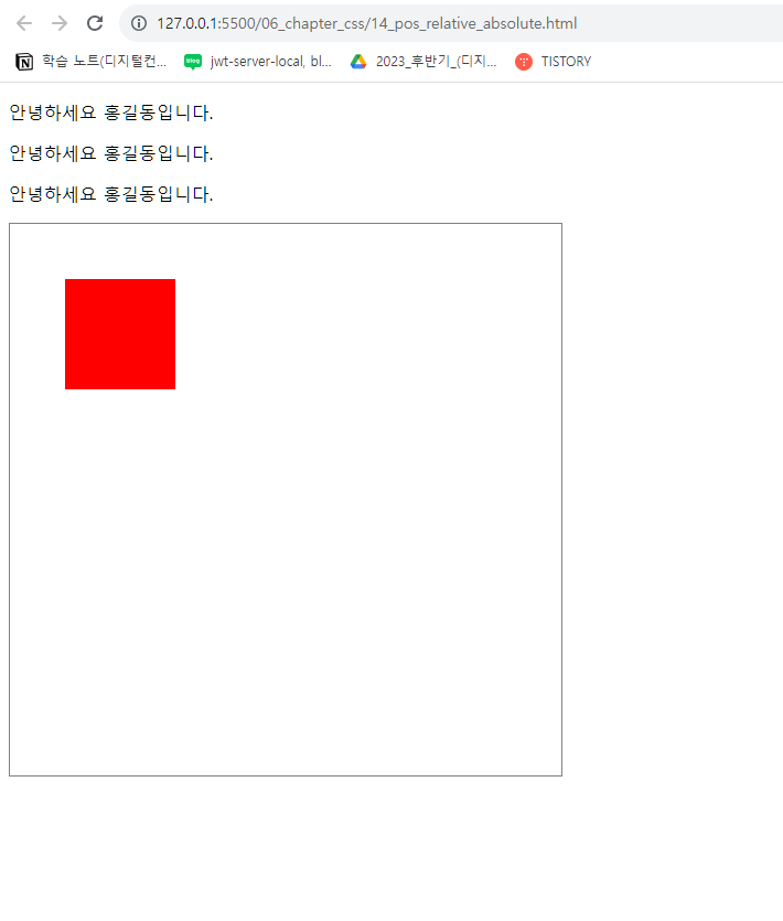

이처럼 p태그가 계속 추가되어도 자식박스의 위치는 부모박스의 기준으로 이동한다.
고정좌표(fixed)
<!DOCTYPE html>
<html lang="en">
<head>
<meta charset="UTF-8">
<meta name="viewport" content="width=device-width, initial-scale=1.0">
<title>Document</title>
<link rel="stylesheet" href="./css/15_position_fixed.css">
</head>
<body>
<!-- 메뉴 -->
<div class="top-bar"></div>
<!-- 본문 -->
<div class="container">
<p>안녕하세요 홍길동입니다.</p>
<p>안녕하세요 홍길동입니다.</p>
<p>안녕하세요 홍길동입니다.</p>
<p>안녕하세요 홍길동입니다.</p>
<p>안녕하세요 홍길동입니다.</p>
<p>안녕하세요 홍길동입니다.</p>
<p>안녕하세요 홍길동입니다.</p>
<p>안녕하세요 홍길동입니다.</p>
<p>안녕하세요 홍길동입니다.</p>
<p>안녕하세요 홍길동입니다.</p>
<p>안녕하세요 홍길동입니다.</p>
<p>안녕하세요 홍길동입니다.</p>
<p>안녕하세요 홍길동입니다.</p>
<p>안녕하세요 홍길동입니다.</p>
<p>안녕하세요 홍길동입니다.</p>
<p>안녕하세요 홍길동입니다.</p>
<p>안녕하세요 홍길동입니다.</p>
<p>안녕하세요 홍길동입니다.</p>
<p>안녕하세요 홍길동입니다.</p>
<p>안녕하세요 홍길동입니다.</p>
</div>
</body>
</html>
/* fixed(메뉴 고정으로 많이 사용) */
/* 주의 : 고정되면 아래 태그가 위로 말려올라옴 */
/* 메뉴 */
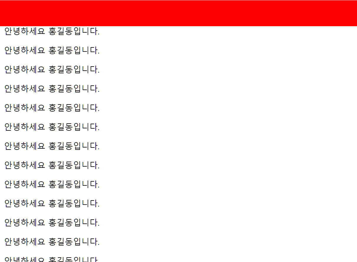
.top-bar{
height: 50px;
background-color: red;
/* 고정(fixed), 좌표 사용가능(left/top/right.bottom) */
position: fixed;
/* 왼쪽(x) */
left: 0;
/* 위쪽(y) */
top: 0;
/* 오른쪽(-x) */
right: 0px;
}
/* 본문 */
.container{
/* 바깥여백-위 */
/* 메뉴박스의 크기만큼 여백을 준다. 박스와 겹침 방지 */
margin-top: 50px;
}
fixed는 메뉴 고정으로 많이 사용한다.
주의점은 고정되면 아래 태그가 위로 말려올라온다.
이것을 방지하기위해 본문에 margin-top을 주어 겹침을 방지한다.
고정좌표(Sticky)
<!DOCTYPE html>
<html lang="en">
<head>
<meta charset="UTF-8" />
<meta name="viewport" content="width=device-width, initial-scale=1.0" />
<title>Document</title>
<link rel="stylesheet" href="./css/16_position_sticky.css" />
</head>
<body>
<!-- 메뉴 -->
<div class="top-bar"></div>
<!-- 본문 -->
<div class="container">
<p>안녕하세요 장길산입니다.</p>
<p>안녕하세요 홍길동입니다.</p>
<p>안녕하세요 홍길동입니다.</p>
<p>안녕하세요 홍길동입니다.</p>
<p>안녕하세요 홍길동입니다.</p>
<p>안녕하세요 홍길동입니다.</p>
<p>안녕하세요 홍길동입니다.</p>
<p>안녕하세요 홍길동입니다.</p>
<p>안녕하세요 홍길동입니다.</p>
<p>안녕하세요 홍길동입니다.</p>
<p>안녕하세요 홍길동입니다.</p>
<p>안녕하세요 홍길동입니다.</p>
<p>안녕하세요 홍길동입니다.</p>
<p>안녕하세요 홍길동입니다.</p>
<p>안녕하세요 홍길동입니다.</p>
<p>안녕하세요 홍길동입니다.</p>
<p>안녕하세요 홍길동입니다.</p>
<p>안녕하세요 홍길동입니다.</p>
<p>안녕하세요 홍길동입니다.</p>
<p>안녕하세요 홍길동입니다.</p>
<p>안녕하세요 홍길동입니다.</p>
<p>안녕하세요 홍길동입니다.</p>
<p>안녕하세요 홍길동입니다.</p>
<p>안녕하세요 홍길동입니다.</p>
<p>안녕하세요 홍길동입니다.</p>
<p>안녕하세요 홍길동입니다.</p>
<p>안녕하세요 홍길동입니다.</p>
<p>안녕하세요 홍길동입니다.</p>
<p>안녕하세요 홍길동입니다.</p>
<p>안녕하세요 홍길동입니다.</p>
<p>안녕하세요 홍길동입니다.</p>
</div>
</body>
</html>
/* position : sticky(고정) */
.top-bar{
height: 50px;
background-color: blue;
/* 고정, 좌표 설정가능(left/top/right/bottom) */
position: sticky;
/* 위쪽 */
top: 0;
}
sticky 속성은 위의 fixed의 부작용인 아래태그가 말려오는 부작용이 없는 것이다.

position을 이용한 중앙배치
<!DOCTYPE html>
<html lang="en">
<head>
<meta charset="UTF-8">
<meta name="viewport" content="width=device-width, initial-scale=1.0">
<title>Document</title>
<link rel="stylesheet" href="./css/17_center.css">
</head>
<body>
<div class="container">
<h1>요소의 중앙 배치</h1>
</div>
</body>
</html>
body{
background-color: pink;
}
.container{
width: 500px;
height: 250px;
background-color: orange;
/* position을 이용한 중앙배치 */
position: absolute;
/* 왼쪽 */
left: 50%;
/* 위쪽 */
top: 50%;
/* 애니메이션 함수 : div를 위치이동시키는 함수 */
/* 보정 : 박스의 가로/세로 크기의 반만큼 위치이동해야 중심이 중앙에 위치함 */
/* 사용법 : transform: translate(가로크기, 세로크기); */
transform: translate(-50%, -50%);
}

반응형
'CSS > CSS 이론' 카테고리의 다른 글
| [CSS] one true layout (0) | 2023.08.14 |
|---|---|
| [CSS] 요소의 중앙 배치 (0) | 2023.08.11 |
| [CSS] float (0) | 2023.08.10 |
| [CSS] display 속성 (2) (0) | 2023.08.10 |
| [CSS] display 속성 (0) | 2023.08.09 |